Yearly Archives: 2012 - Page 8

Pathfinder #1 Coming Next Week!

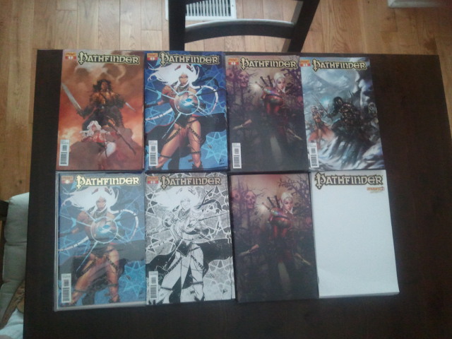
Four boxes of Pathfinder #1 comics arrived on my doorstep this afternoon!


From top left through to bottom right, here are the covers I received:

Dave Dorman cover, Matteo Scalera cover, Erik Jones cover, Lucio Parillo cover, Matteo Scalera limited edition foil, Matteo Scalera black/white line art variant, Erik Jones logo-less variant and the blank sketch cover variant.

22 pages of comic story, 12 pages of RPG rules and background material plus a pull-out battle map, all for only $3.99!

The comic printed really well. Andrew’s line art comes through really clearly, as does Ross’ lush coloring. The battle map isn’t stuck into the issue in any way – it’s folded between the staples so you can remove it without damaging your comic, which was a nice surprise.

Pathfinder #1 will be sold in better comic and gaming shops starting August 15th, just in time for Gen Con, North America’s biggest gaming convention!

Paizo Online Pathfinder Comic Subscription

If you’re signed up on Paizo’s website for Pathfinder products (electronic or physical) you can now directly subscribe to the Pathfinder comic series and receive an exclusive goblin-tastic cover that won’t be sold in stores.

PAIZO DIRECT SUBSCRIPTION

Audio Interview on Comic Book Fury

I chatted with Tim Robinson at Comic Book Fury all about Pathfinder, Shifty Look and Skullkickers. Click on through and give it a listen.

Rambling About How I Write Comics – Part Five

In the previous parts of this tutorial series, I’ve covered brainstorming, story pacing, page planning and scripting. I wanted to get down some of my thoughts on dialogue before I wrap it all up.

Dialogue writing is a unique challenge. In a medium like comics where you rarely have the luxury of using prose to paint a scene, dialogue becomes even more important. The art in a comic makes up a large part of the storytelling experience and the dialogue/narrative text needs to work well with the visuals to create a cohesive collaboration. When dialogue is used properly (and lettered well, but that’s another topic) the comic flows, moving the reader confidently through the story.

As I mentioned in my previous post, dialogue is the only text from the script the reader sees on the finished comic page. Getting character dialogue to sound ‘right’ and inform at the same time is crucial.

How a character speaks tells a reader a lot about their personality, attitude, and motivation. When I describe a scene to the artist in my script, I make sure they’re aware of the character’s attitude and purpose. In short, what they’re doing and why. That way the posing/body language they use fits well with the attitude I want to see coupled with the dialogue I’ve chosen.

Then, the tough part – scripting speech. It’s like acting except I’m playing out the scene in my head, imagining what the character would say in this situation. Remember that characters aren’t necessarily going to spout their motivations aloud. Personality, speech and action all work together to create an interesting and memorable cast. Secrets being kept, confidence, innuendo, sarcasm, wordplay and some times what characters don’t say at all can help communicate different traits.

My first pass is usually long and rambling, pouring out information I think I need to get across. Unless I’m on a roll and really ‘in-character’ the first version I come up with is usually cold and lifeless. Here’s an example, just off the top of my head:


                                     CHARACTER
           If we don’t get out of here by midnight, we’re going to die.

There’s nothing grammatically wrong with that line, but it’s boring. It may be relevant information to a scene I’m writing, but it sounds really generic. It could be attributed to any character in the scene and wouldn’t sound any better or worse. What I try to do is tailor that line to a specific character in the scene and have them say it in a way that accentuates who they are.

If the dwarf from Skullkickers said that same line, it might go:


                                       DWARF
           If we’re nae high-tailed ‘ere by peak o’ the moon, we’re as
           good as corpsed.

It’s the same information, but spoken in a way that feels far more fitting for the dwarf, filled with his particular cadence and personality.

If an occult genius were relaying the same information it could go:


                                      GENIUS
          If we cannot escape by the witching hour, I fear we may not 
          live to see dawn’s light.

Or a neurotic teenager:


                                      TEEN
          We’ve gotta get out before midnight, guys. If we stay... 
          we’re dead meat.

Or the punk protagonist from an M-rated comic series:


                              PUNK WITH TOURETTES
          If we don’t get the fuck out of here before midnight, 
          we’re full-on fucked.

I get into character, try different versions and, most importantly, I say them out loud. The best way to test if the dialogue I’ve written ‘sounds’ right is for me to hear it! Some lines are subtle, others are ridiculous and ham-fisted, it really depends on the character I’m writing. I imagine the scene and speak the dialogue aloud, feeling through whether it flows and properly punctuates the panel I’m working on. Sometimes I’ll find a great line that doesn’t fit in that spot, so I cut and paste it into a separate scrap text file so I can look for a good place to put it later on.

Unless the character I’m writing is known for being overly verbose, I trim fat from the dialogue I write. I try shorter, punchier versions of lines to see if I can get the same information and personality across with less dialogue. When I read a comic that has gigantic word balloons filled to the brim, my eyes tend to gloss over them. I feel like the text is choking the life from the artwork. I want the artist to have room to let loose and strut their stuff. If I have a really dialogue/text heavy page I make sure it’s an absolute necessity for the story. Comics are a visual medium, so if there’s a way I can amp up the visuals instead of info-dumping, I’ll do that instead. When a lot of text is unavoidable, I let the artist know in the script that this section is writing-centric, a quick warning so they can plan their page rough accordingly to give me extra space.

One of the things Skullkickers has given me lots of practice with is writing dialogue for action scenes. I’ve become a bit of a stickler for combat chatter. For me it’s got to be direct and (forgive the pun) punchy. When I read comics where a character spouts five rambling lines of dialogue in mid-air and another three lines as they get punched, I kind of lose my mind. I want my action scenes to feel tense and quick, punctuated with dialogue rather than overwhelmed by it. Occasionally a character can say something mid-attack, but even then it’s going to be short and sweet. I space the talking out over multiple panels so the action keeps moving or avoid acrobatic soliloquies altogether.

Format-wise, I use underlined words in my scripts to indicate that a word should be bold in the final lettering. I use full caps to indicate that it should be a larger font and bold. These indicators help give the dialogue a clear rhythm so the reader knows where to put emphasis while they read.

So the line:


                                       DRIVER
           We’re leaving, Rachel. Get in the truck and don’t say a word.

Could be written as:


                                       DRIVER
           We’re leaving, Rachel. Get in the truck and don’t say a word.

With the words “leaving” and “word” stressed by the speaker, or:


                                       DRIVER
           We’re leaving, Rachel. Get in the truck and don’t say a word.

And this time “Get”, “truck” and “don’t” are given more weight. Say both versions aloud, emphasizing the underlined words, and you’ll feel the difference.

Don’t forget ellipses. They’re an easy way to indicate pauses, slowing down the rhythm of the speech.


                                       DRIVER
           We’re... leaving, Rachel. Get in the truck ...and don’t say 
           a word.

With those ellipses in there it gives a sense that the driver was making his decision after he already started talking. He paused to think about it and then stressed “leaving” to finalize the choice being made. The second set of ellipses creates another pause, like he’s finished his thought about Rachel going to the truck and then remembered to tell her to be quiet. The ellipses change the mood and rhythm of the line quite a bit. The driver here sounds less confident, a bit more shaken, even though the words being used are the same.

Another trick I’ll use is quick italicized descriptions under the character name to let the letterer and artist know how a character feels or where they are in the scene if that’s important. Here’s a quick example, using everything I’ve shown above, all coming together to create a panel with distinctive character dialogue and directions for the artist and letterer.


Panel 3
Driver looks unimpressed as he watches the drunk stumble around off panel.

                                     DRIVER
          Don’t you think you sh-

                                      DRUNK
                       (interrupts Driver, off panel 
                        shaky balloon with uneven text)
          Yu think yu kin order me ‘round ‘ere? FUKOFF, yu! ...I'll
          ...I’ll tell yu shitall!

The panel description is short and clear, stressing that the focus here is the driver’s reaction to what he’s seeing, not the drunk. The drunk’s strange and improper dialogue denotes his emotional state and motivation, using bold words and ellipses to showcase the inebriated rhythm.

Keep dialogue clear, use it to enhance the story and make it character-centric. That’s the technique that’s worked for me.

I hope you’ve found these comic writing ramblings useful. As I stated in earlier posts, this isn’t any kind of absolute-must-follow method, just the way I work and a few tips. If you found these posts helpful, feel free to let me know here (or on Twitter), share the posts with your friends and consider buying some of my comics to show your support.

Also, let me know if you have any questions about the process. I’m thinking of putting together future posts about story pitching if there’s enough interest from people reading along here.

click here to read part 1 of the next tutorial series on pitching story ideas

PS: Mom, if you’re reading this blog post – sorry for all the swearing up there. I love ya. 😛
Rockin’ Reviews for Skullkickers #16

Our latest Skullkickers issue arrived in comic shops last week and I’m happy to say that it’s been met with some of the strongest reviews for the series so far!

Newsarama: “This issue really lets loose and is a zany battle royale from start to finish. 9/10”

eXpert Comics: “…by far one of the most entertaining entries in the series (and with so many damn entertaining issues, that’s saying something). 9/10.”

Major Spoilers: “rude, violent, foul-mouthed, artistic, and all-around well-done. 4/5.”

One Geek Nation: “The sequential storytelling is very innovative and the comedic pacing is spot on.”

Unleash the Fanboy: “Skullkickers #16 is both an excellent example of storytelling and a prime source of humor in comic book form. 4.5/5”

Comic Buzz: “Skullkickers is one of the most fun, irreverent and devil may care comics out there. 9/10”

Image Addiction: “…writer Jim Zub bends a particular genre to his will, incorporating the hilariously beloved Skullkickers flavor into a fast-paced, creature-feature, sea-faring, hyphen-inducing horror comic.”

Silver Snail: “Four high-seas adventures out of five for producing consistent and quality entertainment for those of us who enjoy their share of fantasy and a comedy.”

Things I Like: “I’m perfectly happy to wallow in the madcap action and amusing sound effects.”

Rambling About How I Write Comics – Part Four

In the previous parts of this run through/tutorial, I’ve covered initial brainstorming, story pacing and issue by issue/page by page planning as a way to structure my writing work and make sure I’m delivering everything I need. Finally, we’re at scripting. For a lot of people, the other planning stuff I covered isn’t actually writing, the scripting is. I think it’s all part of the process but, either way, here we are finally at the script.

Comics are quite a unique medium. If you’re reading this I’m sure you already know that. The ability to structure a story with words and pictures in tandem brings a lot of strengths from both prose writing and illustration, while adding a lot of new elements to the mix by combining the two. Placement of text, composition of imagery and size/shape of panels can vastly change how a reader perceives the story.

Some writers leave panel size/shape/focus up to the artist, while others get ridiculously specific. I usually steer towards the “anal” half of that balancing act, but I’m always open to hearing from the artist I’m working with. If they have a better way to present the page and can enhance the impact, that’s awesome. The longer I work with a specific artist, the more comfortable I get in letting them decide. At the start of most new projects I’m quite detailed as I try to establish a baseline for the artist in terms of how the story should feel.

I’ve heard that there are writers who generalize their dialogue and put final speech text in after the art arrives. I’m not one of those people. I want the characters to have an established voice that inspires the artist and, if I need to edit things a bit once the art is done to make it fit better, that’s fine.

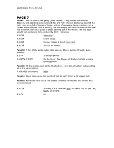
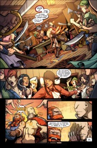
Here’s a sample page of script from Skullkickers along with the finished page from issue 13:

SK13SampleScriptPage

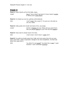
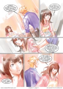
And here’s a sample script page from Makeshift Miracle along with the finished page from chapter 5:

MMSampleScriptPage

You can also check out the complete script for Skullkickers #1 right HERE.


October 2013 Update: Since this post was originally put up I’ve switched my script format to the one used by Fred Van Lente and several other industry writers. It’s a compact template that imparts all the required information with clear caption/balloon/sound effect numbering to make the letterer’s job easier. I’ve updated the samples above to reflect that change and recommend you visit Fred’s website to snag the template for yourself.


The key, for me anyways, is to set each scene as clearly as I can in terms of focus. Quite simply – what needs to be shown in order for a particular page/panel to work? Sometimes I’ll get specific about the panel size or angle if I need a certain effect, but when I’m in the groove I’ll just as often explain the main focus of a panel (the information that needs to be imparted) and let the artist pick an angle that works for them.

One of the strangest parts of writing Skullkickers is explaining what’s supposed to be funny in the script. It’s probably the least funny thing I can do, deconstructing a joke that way, but it’s important that Edwin knows what the reader is supposed to see and why we’re stressing that part so the humor comes through loud and clear. If a reader can’t tell where they’re supposed to be looking or what the focal point is, they’re not going to be amused. The pacing and joke will be lost.

Script cadence and detail is different for every writer. Some use point form notes, others describe in depth. Some people keep it formatted like a movie script, while other comic scripts read like a conversational letter casually written to the artist. Any of those approaches can work if the communication is clear and the artist has all the relevant information they need to illustrate the story.

The script format I’ve grown comfortable with has dialogue inset with underlined words indicating bolded/emphasized words for the letterer. I list each page and the number of panels so it’s really clear to the artist what the pacing is when they’re thumbnailing out their page roughs. Action scenes are rocked out with simple indications of where characters are and what they’re doing. During ‘talking head’ scenes I try to give indication about what characters are doing as well so it’s easier for the artist to think about body language and how that will affect the dialogue.

Coming from an art background, I find it very helpful to imagine how the whole scene plays out in my mind, even though I know the artist will have a different version of it in the end. Visualizing it for myself as I’m scripting helps me think about panel pacing and any setting notes I need to add to the script so the artist has a clear picture in their mind too.

After doing a first draft, when deadlines allow, I let the script sit for a few hours or (ideally) overnight. That way I have time to step away and take a fresh look at it. I re-read through each part to make sure I haven’t missed crucial information or didn’t skip words while typing.

Once I have my story plan and page-by-page pacing list, the scripting process can go quite quick. Since the panel description text only gets read by the editor, artist and letterer I’m less concerned about making it ‘perfect’. The artist is going to bring their own visual ideas into the collaboration and will let me know if something isn’t quite as clear as I imagined it. The most important part of the script is the actual dialogue because that’s what the reader is going to see directly from me on the finished page.

In my next post I’ll go over my dialogue process and some little tricks I use to try and create natural sounding character speech in my scripts.

I hope you find my ramblings useful. If so, feel free to let me know here (or on Twitter) and share the posts with your friends.

Click here to read Part 5

Pathfinder #3 Solicitation

Pathfinder #3

Rating: Teen +
Covers: Lucio Parillo (25%), Matteo Scalera (25%), Tyler Walpole (25%), Erik Jones (25%)
Writer: Jim Zub
Artist: Andrew Huerta
Colorist: Ross A. Campbell
Publication Date: Oct 2012

Page Count: 40 pages
Age range: 16+

Valeros and his companions have captured one of the cultists behind the strange magic that grips the goblin tribes of Varisia, but their prisoner may not be as helpless as they seem. Making matters worse, the group must cross through the haunted cemetery known as Pauper’s Graves, luring them into the paralyzing touch of flesh-eating ghouls.

Paizo’s incredible award-winning fantasy world, fiction line and tabletop RPG is now the ultimate fantasy comic from Dynamite Entertainment.

Includes over 5 pages of character profiles and Pathfinder RPG game statistics, plus an EXCLUSIVE removable, playable tactical map and poster.

Know Direction: Pathfinder Interview

I recorded an extensive interview with the gents over at the Know Direction: Pathfinder podcast all about the upcoming Pathfinder comic series I’m writing. This interview is the most in-depth discussion I’ve had so far about my plans for the comic along with how tabletop RPGs and comics combine in the story I’m putting together for Paizo and Dynamite. Give it a listen.

New Makeshift Miracle Reviews

Two new reviews of Makeshift Miracle: The Girl From Nowhere have gone up this week.

The first one is from Gary Tyrell over at the webcomic news site Fleen. Gary remembers the original 2001-2003 webcomic and does a great job at examining similarities and differences between the two.

“The additional room gives the ability to show more and tell less, making the story ‘less Let me tell you what happened to me’ and more ‘Come along and see what’s going on in my life’.”

The second from literature blog Tempting Persephone, where the reviewer is intrigued enough by the art to give it a recommendation.

“…the art is so lovely, so dreamy, that you might want to run your fingers across each and every smooth page, taking in the color as it melts into another shade under your fingertips.”

Post-SDCC

Some times it takes you 5 days to recover from the big show. 🙂

I’m actually feeling pretty good. This might be the first San Diego Comicon where I got home and didn’t instantly come down with a nasty cold/cough. I wanted to post my post-convention thoughts on Tuesday, but a flurry of work and correspondence after the show has kept me very busy. Stacy and I have had our heads down focused on work, work with a bit more work thrown in for good measure.

This is the year where it really felt like I was firmly established as a creator first and foremost. Last year I promoted Skullkickers quite heavily, but there was a muddiness to it as I tried to balance out administrative responsibilities at UDON with writing and promoting my own material. In 2012 that wasn’t a problem – Skullkickers, Makeshift Miracle, Sky Kid, Wonder Momo, Pathfinder… that’s what I was known for at the show. One of the strangest things was having people ask me about UDON as if I didn’t work there, asking me how I knew “those guys” or who to talk to there about submitting work. When I explained that I’ve worked at UDON for the past 9 years and have been a Project Manager at the company since 2004, they were shocked.

That’s the shift – in a year and a half I’ve tilted the needle from administration/management stuff behind the scenes to writer/creator. It’s a good thing and it’s where I want to be. Creating is far more difficult and comes with a whole lot of extra insecurities and stress, but the satisfaction level is much higher too.

I love handling projects at UDON and I love teaching at Seneca. Having creative outlets for my ideas feels like the missing puzzle piece that makes it all work, weirdly enough. It’s proof that I can handle client projects. It’s proof that I have things to teach about storytelling and art. It’s a series of escalating challenges that keeps me pushing my skills so I don’t get complacent.

Anyways, that was my biggest take away from SDCC this year. Sales were pretty good, social stuff was fun, my body ached after 5 days of work and late nights… after 10 years I go in expecting most of that. What changed this time was my perception of what I’m doing there. In the midst of grandiose pop culture chaos I felt like a storyteller and that was pretty cool.