Here’s a step-by-step walk through of the illustration I put together for Emerald City Comicon’s Monsters & Dames art book coming out in March.
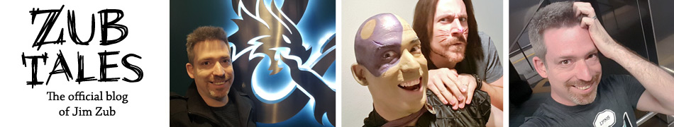
The initial concept I had in mind was a huge lumbering creature protecting a child. Starting with swooping sketched out shapes I started doodling, looking for forms and silhouette that would look interesting and give the impression of size that I wanted.
Once those larger forms started to take shape as something with a massive upper body and ape-like arms, I quickly defined them a bit more with some rough contour shapes to get a sense of the perspective for the piece. All this was done in Photoshop on my Cintiq, but it could just as easily have been pencil and paper.
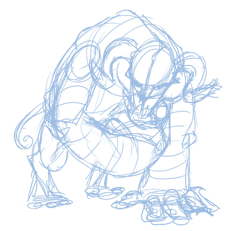
Starting a new layer, I went in with a darker blue and made some decisions about forms, trying to nail down the general anatomy of the creature and to get a sense of proportion. I like where it’s going, so I threw in some really rough light and shadow to help me visualize it more solidly.
There’s an intimacy in this stage that I still really like. The girl’s expression is more comforting and I think it’s actually bit more emotional than the final version.
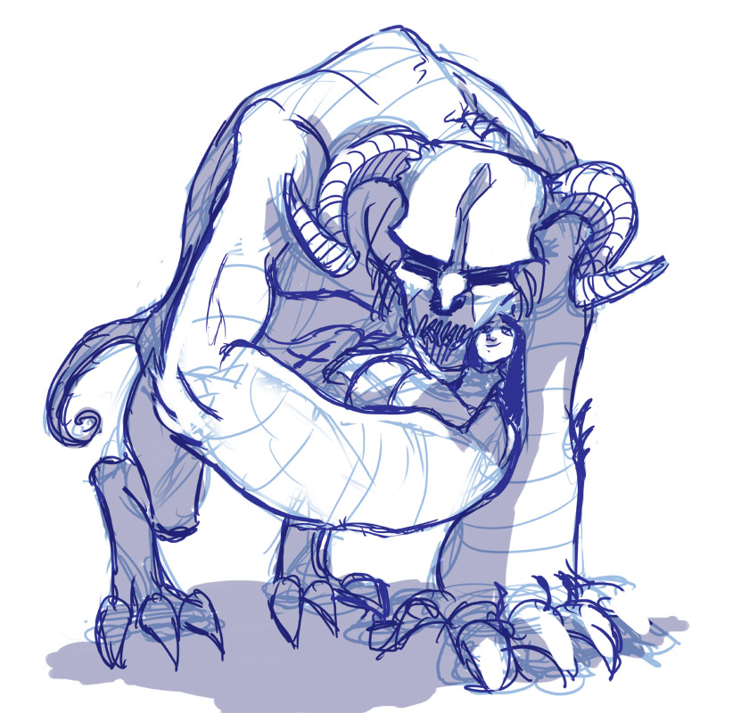
Gathering some reference material of monsters and taking a bit of a break, I came back to the piece and decided to do another sketch over, adjusted the stance and making it even larger. I wanted the creature to look bigger and more menacing. The creature’s skull is now more bestial and its eyes are more inhuman.
The girl’s proportion changes too and now I’m visualizing something Egyptian for her outfit and jewelery.

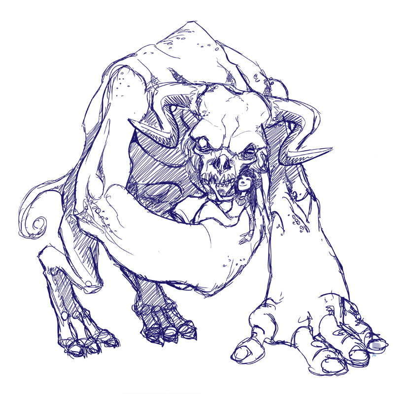
This is the final line art scanned in. At first I was thinking of inking this digitally, but the whim struck me to go back to traditional for the line art, so I penciled this out on Bienfang Rag Marker Paper (which I really like using because it’s nearly see though but has more substance than tracing paper). Most of it’s done with an F pencil, though added the thicker outline with a B.
After it’s scanned in I use Image> Adjustments> Levels in Photoshop to darken up the line art and push the paper base tone to white.

Here are the Colour Flats. These are the tones I start with, kept on their own layer so I can easily select certain portions of the illustration and isolate them for colour adjustments later on. It also lets me see what the base colours are before any rendering so I can decide if it’s all working well together.

The first rendering step is adding the main shadows and deciding the direction of light. I opt for light coming from the upper right and then imagine it striking down on the figure.
Which parts are facing the light?
Which parts are facing away from light?
Which parts overlap to create shadows as they block another area from light?
As I put down each shadow that stuff becomes more clear.

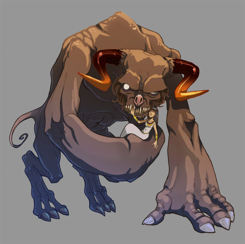
Now I do the opposite with the highlights, isolating anatomy that’s facing the light and enhancing those with a lighter colour. I also add in a blue/purple bounce light on the left side to help bring out some extra details in the shadow areas.
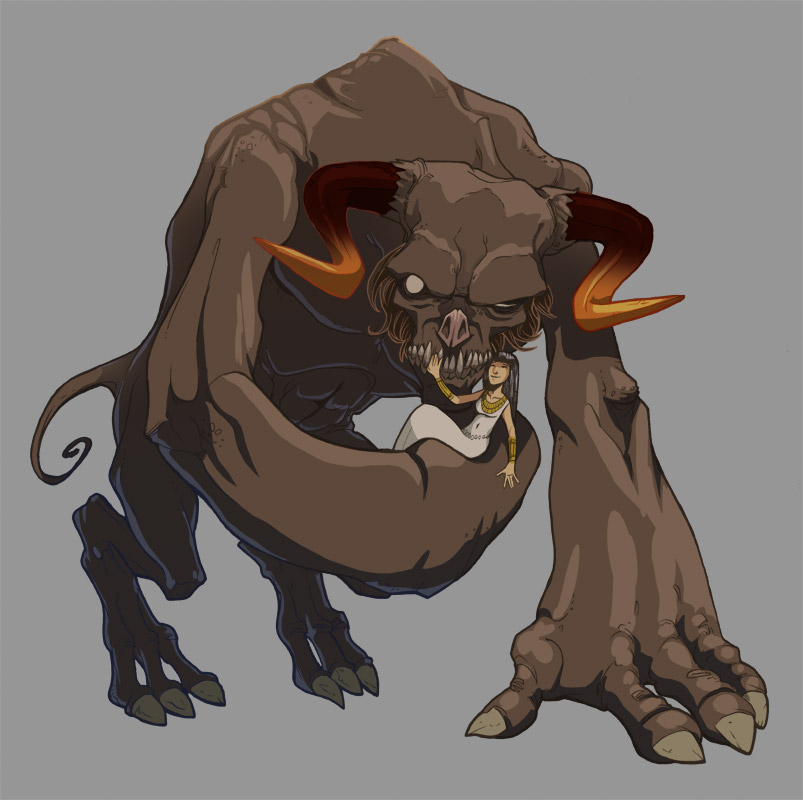
I soften the look of the black line art by colouring some of those lines to give it a bit of an animation cel feel. This also helps to pop out the hair detail by the monster’s face. The horns were looking pretty bland so I add a dark to light gradient transition of colour. It’s starting to come together.
The last chunk involves a lot of finicky stuff – enhancing the contrast and saturation, adding smaller details to the skin, pushing highlights on the horns and jewelry and adding a blue-purple haze to the base of the piece to enhance the feeling of size and make it look more creepy.
Rendering light and shadow can be confusing with complex shapes, but in reality the formula for light in this piece is pretty straight forward:

All surfaces of the creature facing ‘up’ get the highlight tone.
All surfaces of the creature facing ‘right’ get the base tone.
All surfaces of the creature facing ‘left’ or ‘down’ get the shadow tone.
Then the whole piece gets an extra blue-purple base light kick.
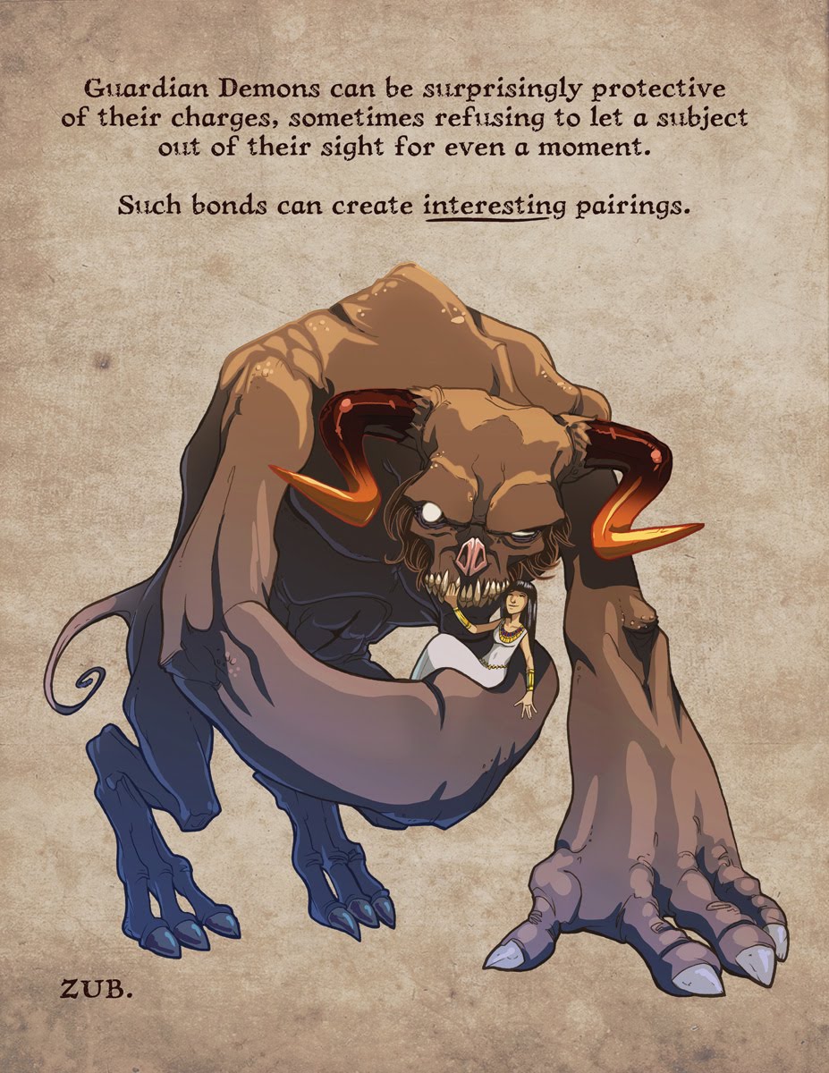
Here’s the final again, with minor tweaks and background/text added:
I hope you found this walk through of the process useful.


 Zub on Amazon
 Zub on Instagram
 Zub on Twitter
 Zub on YouTube
 Follow this blog's RSS feed
 Makeshift Miracle
Wow. Awesome. Thanks for showing us your process from the beginning to the end. Very enlightening and really insightful and cool to see. Thanks for sharing!