Let’s talk about comic covers.
A strong and evocative cover with a well-designed logo grabs attention and builds anticipation for the story inside. It’s your eye-catcher, sales pitch, and branding all wrapped up in one illustration. When it comes to creating your comic, the cover image may be your only chance to entice a retailer or reader to invest in you. It’s a crucial part of the whole package.
Sounds great, but with so many other comics on the shelves and colorful artwork vying for customer attention, how can you stand out in such a crowded field?
I’ve seen a lot of great looking artwork gracing the front cover of independent books, but many of them aren’t effective as cover imagery. Too many lack focus, clarity, or a visual hook and they don’t compel a new reader to pick it up and start browsing.
When you start putting together ideas for a cover, pull back and think carefully about the first impression you want to make.
• What is the genre?
• What is the mood?
• Who/what is most important?
In short, what do you want to communicate right off the bat about this story and what’s the clearest way of showing that?
No matter how complex or in-depth the story inside is or how many characters are in the cast, you need to simplify. The cover for a brand-new project you’re trying to sell is not the place to have a crazy montage of characters or a jumble of imagery all at once. A postage stamp collection of visuals isn’t direct and doesn’t stand out from a distance, which is what you need when people aren’t already aware of the creators, the characters, or the story.
Let me give you some examples from my creator-owned series:
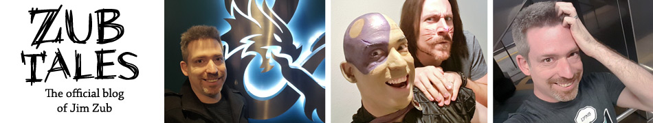
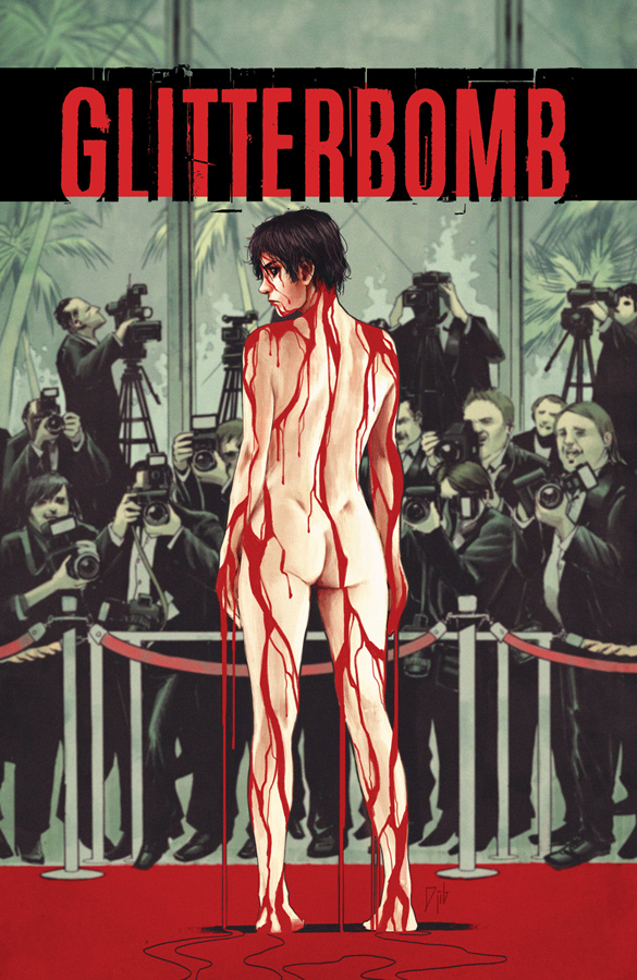
Glitterbomb is a Hollywood horror story, but I wanted to emphasize the “horror” aspect for our first cover.
What did we want to communicate?
Otherworldly, possession/transformation, foreboding
That’s exactly what Djibril Morisette-Phan, my wonderful collaborator on the series, delivered.
Here’s another crucial element – the cover is an iconic composition that can be identified from 6-10 feet away.
When designing a cover and trade dress, print it out the same size it will be as a book, go to your local comic shop and put it on a shelf full of other comics, then take 5-6 steps back…
• Is it visible?
• Does it stand out?
• If someone was looking for it, would they find it?
• Could it grab the attention of a new customer?
Glitterbomb #1 communicates the mood of our series and grabs attention. Farrah, our main character, stares right at the reader, compelling you to stare back. It’s arresting and full of atmosphere, eye-catching and memorable.
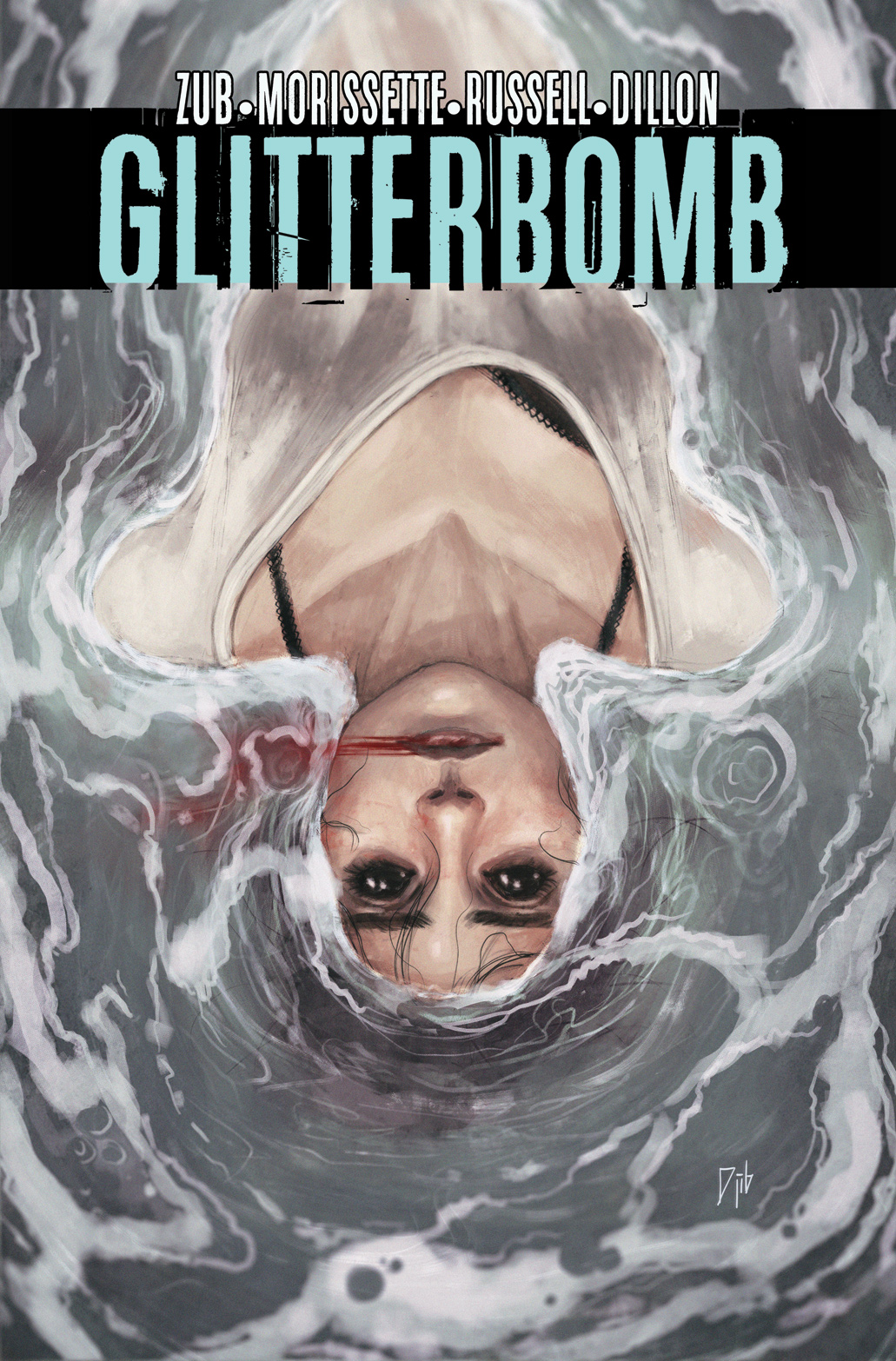
Almost every cover for Glitterbomb communicates similar ideas. Some lean on the Hollywood elements but all of them have a sense of horror/foreboding. They prepare readers for the journey:
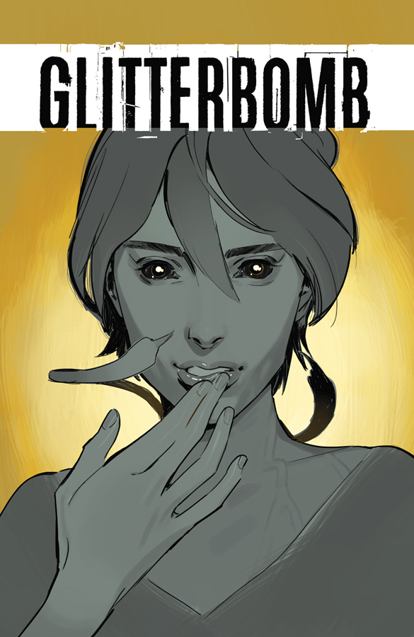
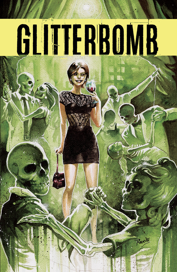
Also note that even with these thumbnails before you make them full size, you can easily identify the subject and the logo stands out. The core shapes that make up the design and the colors aren’t muddy or indistinct. Clarity is crucial.
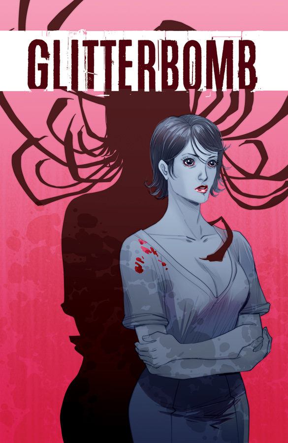
The third cover for The Fame Game our second Glitterbomb mini-series (shown here publicly for the first time) is one of my favorites so far:
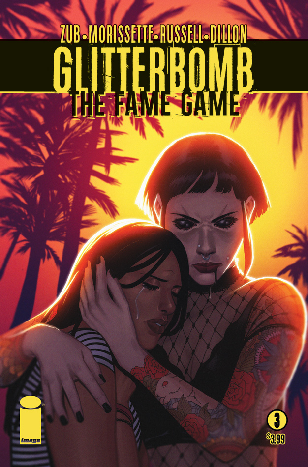
The California sunlight should be warm and inviting, but it contrasts with the creepy supernatural eyes and expression to turn that sunlight into something harsh. It’s a great mix of our horror & Hollywood themes.
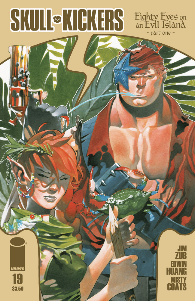
Compare those Glitterbomb covers to some of the best ones from Skullkickers, my action-fantasy sword & sorcery series, also published by Image:
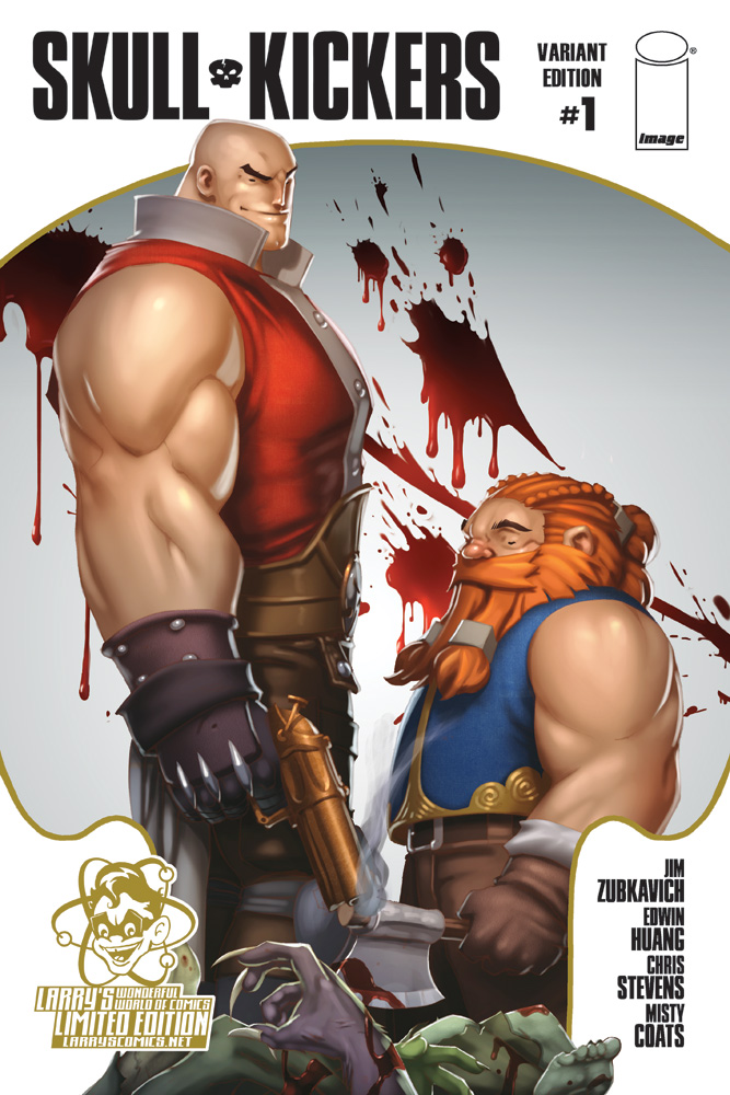
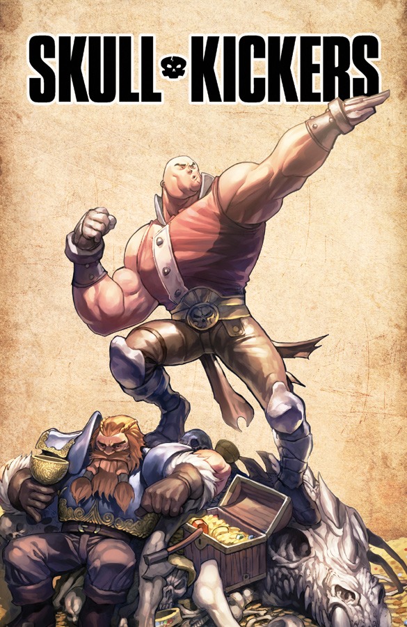

What do they communicate?
Violent but whimsical, fantasy, comradery, adventure.
What you see on that cover is what you get within the pages. Our best covers exemplified those core ideas while teasing events happening inside. Simple and direct, but also telling the reader if this book might be for them.
A great cover for a new property is more than a montage of characters we don’t yet know or care about. It’s more than a character looking cool without any context.
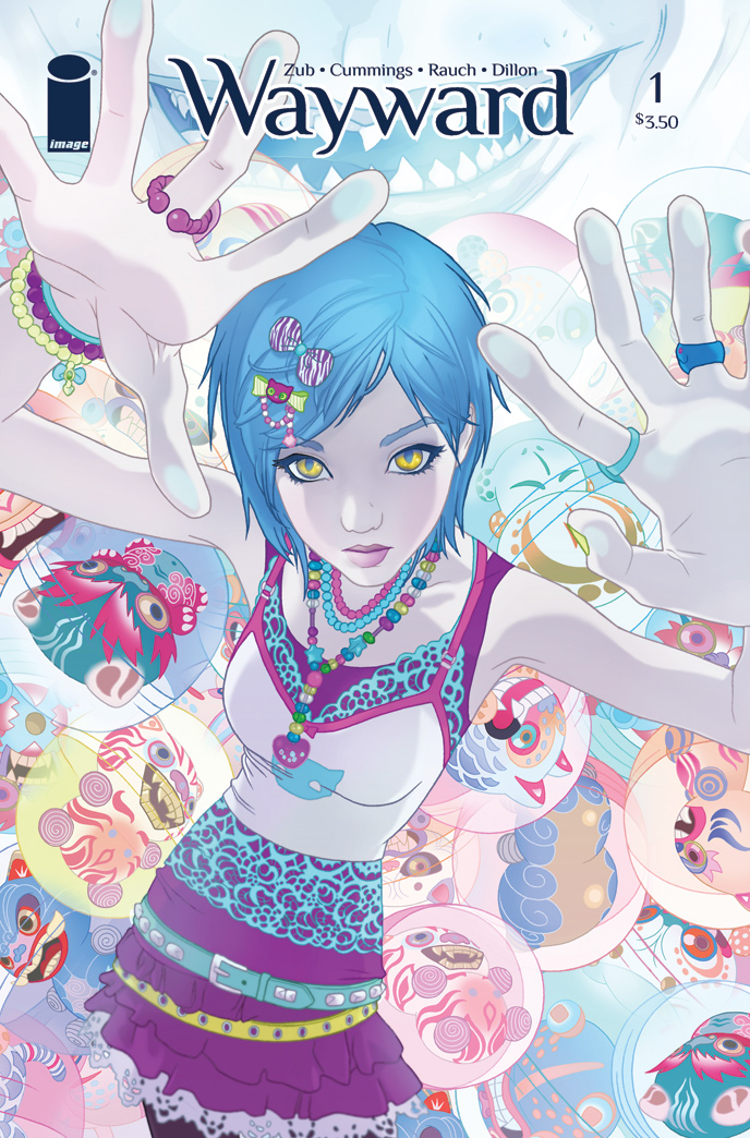
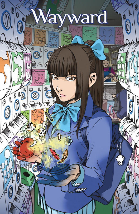
I think the most effective cover on a creator-owned book I’ve worked on has been Wayward #1, by Steven Cummings with colors by Ross A. Campbell:
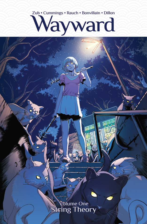
Supernatural. Teen. Ready to kick ass.
That powerful image coupled with our elevator pitch that Wayward is like “Buffy in Japan” did wonders for our series launch. It branded us and brought in readers in a big way. I can’t even count the number of people who have stopped to browse and buy Wayward Vol. 1 thanks to that killer cover.
“Oh wow, what is that?”
“Who is she?”
“Kitties!”
It’s been powerful mojo for us. It breaks the ice and invites inspection.
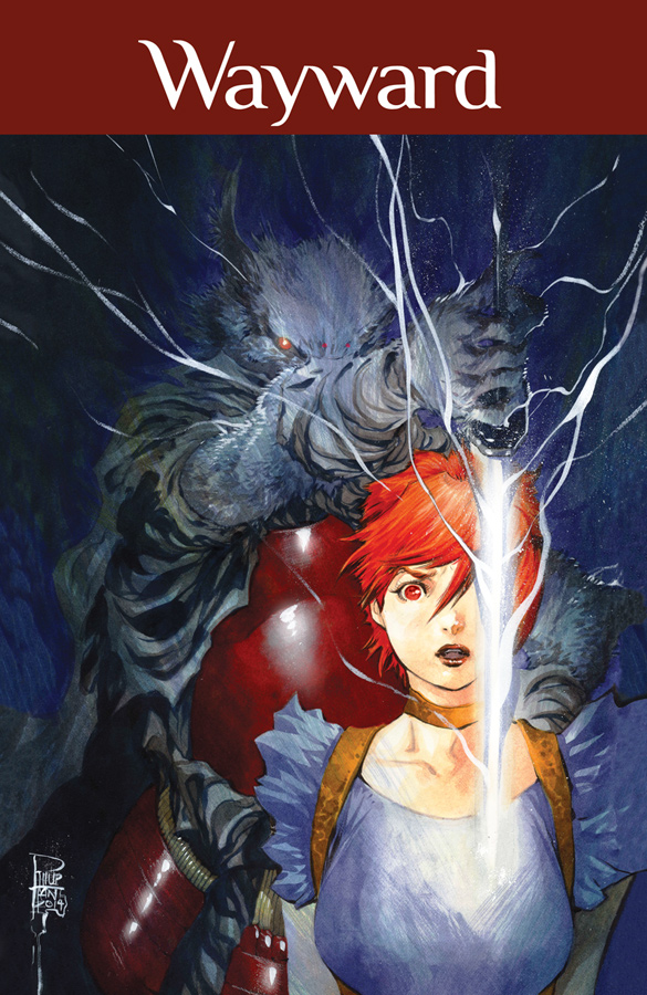
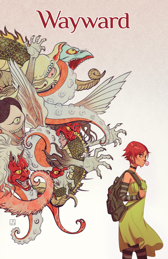
Our best covers have created a similar feeling of teenage supernatural adventure taking place in Japan:
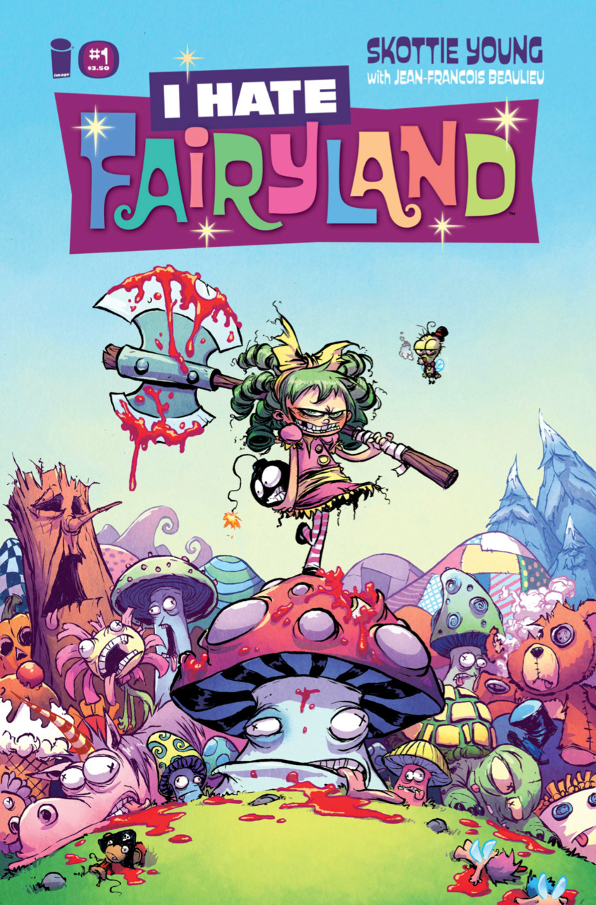
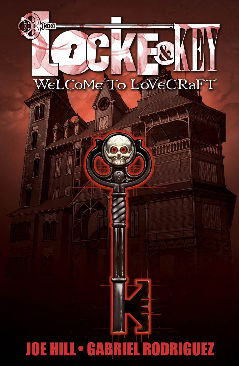
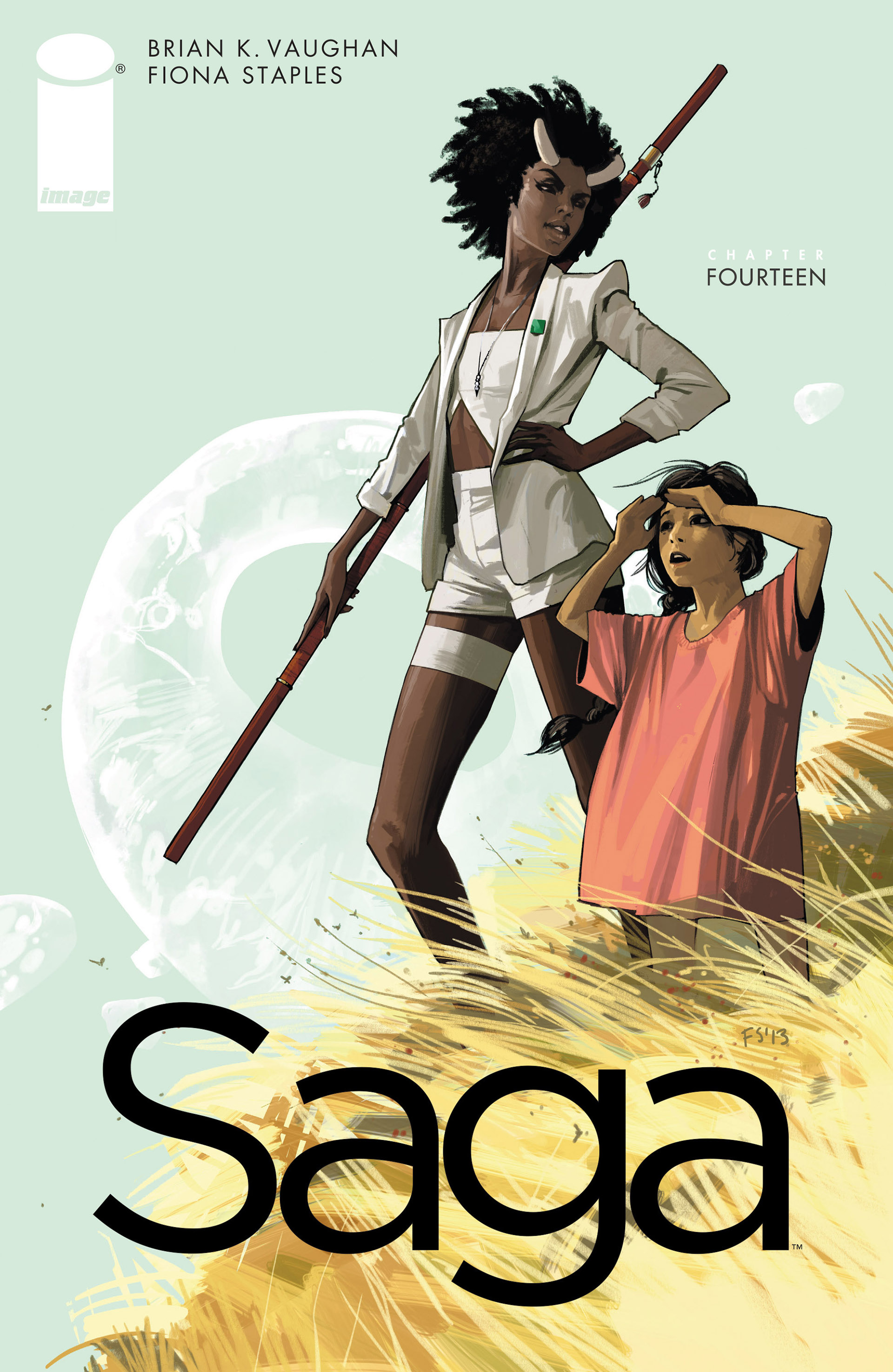
Here are some other creator-owned comic covers that showcase clarity and concept. Each one brands the series and prepares the reader with subject and mood. Each one is inviting and visible from across a room:

I don’t think there’s only one way to do covers. You can have storytelling-centric covers, design-based covers, abstract high concept covers, or anything else you want, but in each case you need to grab attention and deliver a sense of what readers can expect inside.
The cover is an airlock that separates our real world from the world within those pages. It communicates a feeling and prepares the audience. Do it well and you can bring in complete strangers who might otherwise have passed you by.
If you found this post interesting, feel free to let me know here (or on Twitter), share the post with your friends and consider buying some of my comics, donating to my Patreon, or buying comics from me in person if you see me at a convention.


 Zub on Amazon
 Zub on Instagram
 Zub on Twitter
 Zub on YouTube
 Follow this blog's RSS feed
 Makeshift Miracle
The Wayward #1 variant cover by Alina Urusov is a stunner. I’ve followed Wayward since the first issue, and I’ve hoped she’ll do another variant for the series some happy day. If she has, I’ve missed it.
Jorge Molina’s Wayward cover was eye-catching, too. So good.
This post was interesting and fun, but it left me wondering why you use variant covers, how you select the image on the covers or which alternate cover artists to use (since Steven Cummings is a given). If you ever do a follow-up, I’d love to read it.