A couple months ago IDW asked me if I had a good suggestion for an artist who could do up a retailer-incentive cover for Samurai Jack #1. Andy Suriano, the regular artist on the series, was slammed with other work and they wanted him to keep plugging away on the interior art for the first issue. Not trying to come across as presumptuous, I asked if I could have a shot at it. Thankfully they said “Yes” and it all turned out.
Here was my process on creating the cover art:

I wanted to create an image that was symmetrical and bold, something that would fit the style of the show and would also channel the look of an old samurai movie poster. I started with the looming shape of Aku and then placed Jack stoically standing in the middle. I don’t normally show people my chicken-scratch gestures, but this is how most of my drawings start. What’s most important is the overall appeal of the shapes intersecting and the composition.

From there I looked up some reference for the characters to make sure their proportions were correct and started tightening up the rough. It’s still sloppy, but the posing is a lot clearer.
I added some quick shadows and colors to the piece to see how they would work together. The Samurai Jack animation style relies on bold simple shapes and colors and I wanted to put that feel into my piece without copying any particular still from the show.
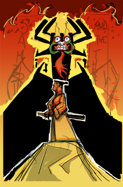
I asked Steve Cummings, a good friend of mine (and amazing artist) living in Tokyo, if he could help me with translating the title “Samurai Jack and the Threads of Time” for the cover illo. He helped me out with the translation and positioning of the individual characters. This was the rough version I sent along to IDW and Cartoon Network for approval.

Once IDW/CN gave me the go ahead, I printed out a light blue line version of the rough lines on to 11″ x 17″ paper, then traditionally inked it. I like working digitally, but felt that the imprecise nature of the real ink line would fit well with the Japanese poster look I was going for. After scanning in the final, I adjusted the levels in Photoshop to get the stark black and white line work.
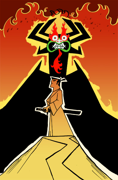
This is midway through coloring. The rendering process on a flat-graphic illustration like this can be quicker than fully painted work, but the “less is more” approach also lead me to a lot of experimentation to get the right balance between the colors, textures and lines.

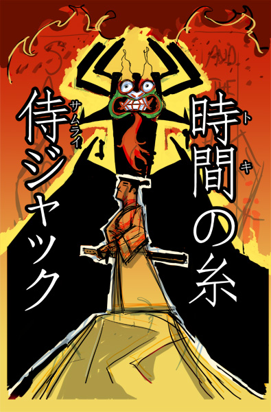
Steve Cummings asked his friend Makoto Nishi if he could do the traditional ink calligraphy for the title and he did up several wonderful sets for me to choose from. It added the perfect traditional finish to the piece and looked ten times better than just using a Japanese font to create the title. Here’s a sample of that beautiful ink brush lettering before it’s digitally inverted and added to the illustration.
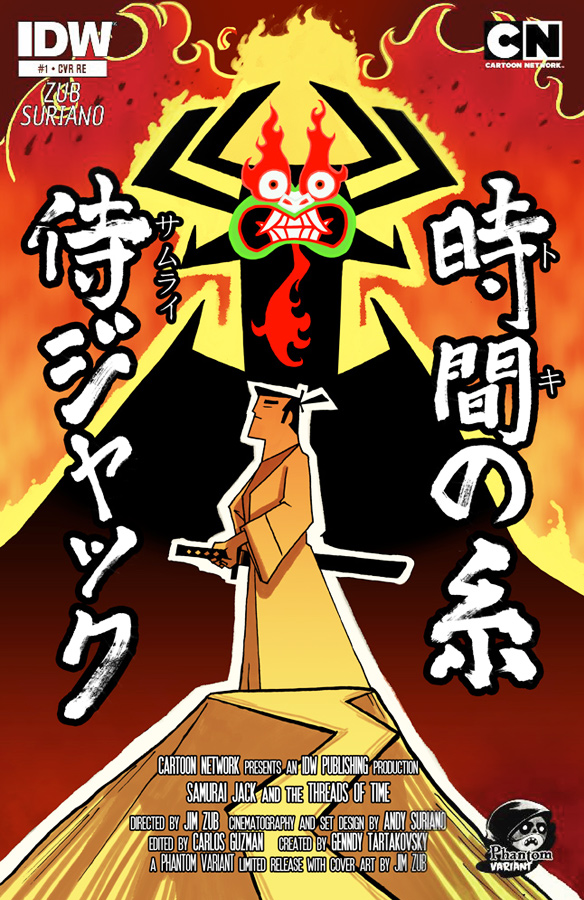
And here’s the finished cover with all the titling and graphics in place. I’m really proud of how this turned out and can’t wait to have the printed version of the issue in my hands.
Contributing to Samurai Jack, now as both a writer and as an artist, is a real dream come true for me. I hope fans of the cartoon enjoy the further adventures of Jack that Andy Suriano and I are putting together.
Samurai Jack #1 should be in comic shops on October 23rd. Have you pre-ordered your copy yet?


 Zub on Amazon
 Zub on BlueSky
 Zub on Instagram
 Zub on YouTube
 Follow this blog's RSS feed
 Makeshift Miracle
Really enjoyed your step by step process and love the cover work! Amazing! Nice work. So well done.